前言:
该网站的代码大都是东拼西凑来的,部分由ChatGPT代写,不过能在本网站运行起来就说明问题不大。
这篇文章目的一是分享经验,二是防止本人忘了里面代码都是什么意思,也算是备注。
前提:
你的网站是由WordPress搭建,并使用Argon主题,除此之外的网站或主题不保证正常生效。
相关网站:
感谢这些大佬的分享:
部分内容直接来源于此,也可以参照大佬们的教程自己改
具体内容
页面向下滚动,背景逐渐模糊变成毛玻璃的效果:
进入 WordPress 后台 → 外观 → 主题文件编辑器,
打开 header.php,
找到 <body> 标签,
在 <body> 标签下立刻添加:
<div id="scroll-glass"></div>然后是额外CSS代码
/* 导航栏过渡 */
#navbar-main {
    transition: background-color 0.4s ease, backdrop-filter 0.4s ease;
}
/* 滚动毛玻璃覆盖层 */
#scroll-glass {
    position: fixed;
    inset: 0;
    z-index: -1;
    pointer-events: none;
    opacity: 0;
    backdrop-filter: blur(0px);
    background: rgba(255,255,255,0);
    transition: opacity 0.4s ease, backdrop-filter 0.4s ease, background 0.4s ease;
}

/* 顶栏滚动激活状态 */
#navbar-main.scrolled {
    background-color: rgba(120,170,220,0.35) !important;
    backdrop-filter: blur(18px) !important;
    transition: background-color 0.4s ease, backdrop-filter 0.4s ease;
}
然后是WPCode中添加一段JavaScript代码 该代码要设置为加入到页脚(注:WPcode是wordPress网站的一个插件,要自己在网站后台里下载安装)
(function(){
    // 创建 scroll-glass 层
    if(!document.getElementById('scroll-glass')){
        const glass = document.createElement('div');
        glass.id = 'scroll-glass';
        document.body.prepend(glass);
    }

    const glass = document.getElementById('scroll-glass');
    const navbar = document.getElementById('navbar-main');

    window.addEventListener('scroll', ()=>{
        if(window.scrollY > 200){
            glass.style.opacity = '1';
            glass.style.backdropFilter = 'blur(4px)';
            glass.style.background = 'rgba(255,255,255,0.08)';

            navbar.classList.add('scrolled');
        } else {
            glass.style.opacity = '0';
            glass.style.backdropFilter = 'blur(0px)';
            glass.style.background = 'rgba(255,255,255,0)';

            navbar.classList.remove('scrolled');
        }
    });
})();
顶栏菜单中,左边网站图标可能过小,修改图标大小:
额外CSS中添加:
.navbar-brand img {
height: 60px;
}
大小可以自己更改。
文章的3D卡片效果:
这里是仿照“鸦鸦的巢穴”做的,她本人那里也有教程,所以看你的喜好喽。
不过大佬手搓的应该比我Chatgpt的效率高一些。
额外CSS中添加:
/* 3D卡片基础 */

.post-preview{

    position: relative;

    transform-style: preserve-3d;

    transition:
        transform .18s ease,
        box-shadow .18s ease;

    will-change: transform;

    overflow: hidden;
}

/* 阴影增强 */

.post-preview:hover{

    box-shadow:
        0 20px 40px rgba(0,0,0,.12) !important;
}

/* 光泽层 */

.post-preview::before{

    content:"";

    position:absolute;

    inset:0;

    pointer-events:none;

    opacity:0;

    background:
    radial-gradient(
        circle at var(--x,50%) var(--y,50%),
        rgba(255,255,255,.18),
        transparent 35%
    );

    transition:opacity .2s;
}

.post-preview:hover::before{

    opacity:1;
}
Javascript代码,直接添加就行
document.addEventListener("DOMContentLoaded", function(){

    const cards = document.querySelectorAll(".post-preview");

    cards.forEach(card => {

        card.addEventListener("mousemove", e => {

            const rect = card.getBoundingClientRect();

            const x = e.clientX - rect.left;
            const y = e.clientY - rect.top;

            card.style.setProperty("--x", x + "px");
            card.style.setProperty("--y", y + "px");

            const rotateY =
                (x - rect.width / 2) / 40;

            const rotateX =
                -(y - rect.height / 2) / 40;

            card.style.transform =
                `perspective(1200px)
                 rotateX(${rotateX}deg)
                 rotateY(${rotateY}deg)
                 scale(1.02)`;
        });

        card.addEventListener("mouseleave", () => {

            card.style.transform =
                "perspective(1200px) rotateX(0deg) rotateY(0deg) scale(1)";
        });

    });

});
你也可以改成我这样,变得跟我的网站一样,晃动幅度看你个人喜好吧,你也可以改的更大或更小。
const rotateY =
                (x - rect.width / 2) / 80;

            const rotateX =
                -(y - rect.height / 2) / 80;

scale(1.01)
然后关掉Argon主题设置中的PJAX选项,要不然你的3D卡片会变成一次性的。
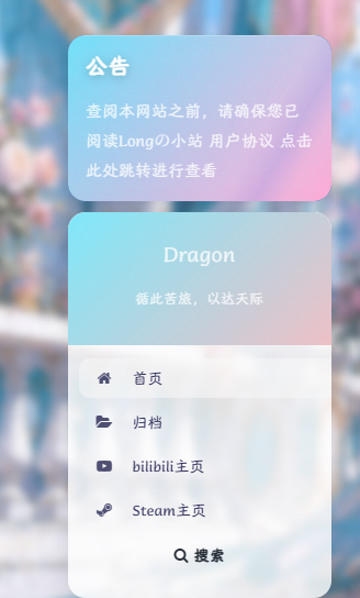
更改公告栏颜色:
通常来讲公告栏颜色会随Argon主题颜色变化,没法单独更改,但是实在是太丑了。
把下面额外CSS加进去就会变成我网站的清粉渐变了,颜色可以自己调
#leftbar_announcement .leftbar-announcement-body{

    background:
    linear-gradient(
        135deg,
        #6EE7F9,
        #FF9FD2
    );

    border-radius:12px;
}

#leftbar_announcement .leftbar-announcement-title,
#leftbar_announcement .leftbar-announcement-content{

    color:white !important;
}
左侧菜单栏:
连带着一块把左侧菜单栏改了吧
插入额外CSS
.leftbar-banner{

    background:
    linear-gradient(
        135deg,
        #7EE8FA,
        #EEC0C6
    );

    backdrop-filter:blur(20px);
}
#leftbar .card{

    border-radius:16px !important;

    overflow:hidden;
}
同样也是我网站的青粉渐变,改颜色直接改#右面的数字就行。
卡片悬浮光泽:
可以让你的3D悬浮卡片更有质感一些?
插入额外CSS
/* 卡片悬浮光泽 */
.post-preview{
position:relative;
overflow:hidden;
}
.post-preview::before{
content:"";
position:absolute;
inset:0;
opacity:0;
pointer-events:none;
transition:.3s;
background:
radial-gradient(
circle at var(--x) var(--y),
rgba(255,255,255,.25),
transparent 40%
);
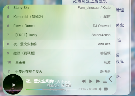
}关于左下角音乐播放器:
怎么生成有一个:
打开Argon主题选项,选到页尾脚本,直接把下面代码复制进去就行。
<link rel="stylesheet" href="https://cdn.jsdelivr.net/npm/aplayer/dist/APlayer.min.css">
<script src="https://cdn.jsdelivr.net/npm/aplayer/dist/APlayer.min.js"></script>
<script src="https://cdn.jsdelivr.net/npm/meting@2.0.1/dist/Meting.min.js"></script>

<meting-js
    server="netease"
    type="playlist"
    id="18010115990&uct2"
    fixed="true"
    mini="true"
    order="random"
    loop="all"
    preload="auto"
    list-folded="true">
</meting-js>
id= 这里是你的网易云歌单,上面的歌单是我自己的,建议填自己的歌单
这里引用Echo大佬的解释
**
server="netease"指定音乐平台为网易云,type="song"
指单曲类型,id="7373135320"为音乐的 id(这里的id为打开音乐歌单,网址显示的id)**开启吸底模式
fixed="true", 开启迷你模式mini="true", 随机播放order="random", 关闭底部歌词lrc-type="0"
注意:id需要为自己创建的歌单,不能为我喜欢的音乐;server可以改自己用的音乐平台,如netease(网易云)、tencent(QQ音乐)
Aplayer播放器官网文档:[APlayer HTML5音乐播放器 | ACE-BLOG
(ace520.github.io)](https://ace520.github.io/blog/post/2020/05/26/aplayer/)
除了server·id·order·loop以外,其他的地方不建议更改,否则会出现其他的小问题,不过如果出问题了也可以交给AI去解决。
具体美化:
这部分是我问ChatGPT搞来的,你也可以喂给AI做更一步的修改。
插入额外CSS
/* ---------- 主播放器 ---------- */
.aplayer.aplayer-fixed {
    left: 20px !important;
    bottom: 20px !important;
    z-index: 9999 !important;

    background: rgba(255,255,255,0.08) !important;
    backdrop-filter: blur(35px) saturate(220%);
    -webkit-backdrop-filter: blur(35px) saturate(220%);

    border: 1px solid rgba(255,255,255,0.08) !important;
    border-radius: 24px !important;
    overflow: visible !important;

    box-shadow: 0 8px 40px rgba(0,0,0,.18), inset 0 1px 0 rgba(255,255,255,.08);
    transition: all .35s ease;
}

/* ---------- 主体内容 ---------- */
.aplayer.aplayer-fixed .aplayer-body {
    background: rgba(255,255,255,0.08) !important;
    border-radius: 24px !important;
    overflow: visible !important;
}

/* ---------- 封面 ---------- */
.aplayer-pic {
    width: 72px !important;
    height: 72px !important;
    border-radius: 999px !important;
    overflow: hidden !important;
    box-shadow: 0 0 25px rgba(120,180,255,.25);
}

/* ---------- mini / 折叠模式 ---------- */
.aplayer.aplayer-fixed.aplayer-mini,
.aplayer.aplayer-fixed.aplayer-narrow {
    width: 72px !important;
    height: 72px !important;
    border-radius: 999px !important;
    overflow: hidden !important;
    background: rgba(255,255,255,0.08) !important;
    backdrop-filter: blur(35px) saturate(220%) !important;
    -webkit-backdrop-filter: blur(35px) saturate(220%) !important;
    border: 1px solid rgba(255,255,255,0.08) !important;
}

/* mini 主体 */
.aplayer.aplayer-fixed.aplayer-mini .aplayer-body,
.aplayer.aplayer-fixed.aplayer-narrow .aplayer-body {
    width: 100% !important;
    height: 100% !important;
    background: rgba(255,255,255,0.08) !important;
    border-radius: 999px !important;
    overflow: hidden !important;
}

/* mini 封面 */
.aplayer.aplayer-fixed.aplayer-mini .aplayer-pic,
.aplayer.aplayer-fixed.aplayer-narrow .aplayer-pic {
    width: 72px !important;
    height: 72px !important;
    border-radius: 999px !important;
    overflow: hidden !important;
}

/* ---------- 歌曲信息 ---------- */
.aplayer-title {
    color: #fff !important;
    font-weight: 600;
}
.aplayer-author {
    color: rgba(255,255,255,.65) !important;
}

/* ---------- 进度条 ---------- */
.aplayer-bar {
    background: rgba(255,255,255,.08) !important;
    border-radius: 2px;
}
.aplayer-played {
    background: linear-gradient(90deg, rgba(120,180,255,.95), rgba(255,160,200,.95)) !important;
    border-radius: 2px;
}

/* ---------- 控制按钮 ---------- */
.aplayer-icon {
    transition: all .25s ease;
}
.aplayer-icon:hover {
    transform: scale(1.15);
}

/* ---------- Hover 微动效 ---------- */
.aplayer.aplayer-fixed:hover {
    transform: translateY(-3px);
    box-shadow: 0 15px 50px rgba(0,0,0,.22), inset 0 1px 0 rgba(255,255,255,.15);
}

/* ---------- 去掉所有白边 ---------- */
.aplayer, .aplayer *, .aplayer-body, .aplayer-info, .aplayer-list {
    border: none !important;
}

/* ---------- 流光动画层 ---------- */
.aplayer.aplayer-fixed::before {
    content: "";
    position: absolute;
    inset: -50%;
    z-index: 0;
    pointer-events: none;
    background:
        radial-gradient(circle at 20% 20%, rgba(120,180,255,.18), transparent 45%),
        radial-gradient(circle at 80% 80%, rgba(255,160,200,.12), transparent 45%);
    filter: blur(35px);
    animation: acrylicFloat 10s ease-in-out infinite;
}
@keyframes acrylicFloat {
    0% { transform: translate(-3%,-3%); }
    50% { transform: translate(3%,3%); }
    100% { transform: translate(-3%,-3%); }
}

/* ---------- 歌单 ---------- */
.aplayer-list {
    background: rgba(255,255,255,.08) !important;
    backdrop-filter: blur(35px) saturate(220%) !important;
    -webkit-backdrop-filter: blur(35px) saturate(220%) !important;
    border-radius: 20px !important;
    overflow-y: auto !important;
}
.aplayer-list-light {
    background: rgba(120,180,255,.12) !important;
}
.aplayer-list-song {
    background: transparent !important;
    color: #fff !important;
    padding: 8px 16px !important;
    border-bottom: 1px solid rgba(255,255,255,0.1) !important;
    transition: all .25s ease;
}
.aplayer-list-song:hover {
    background: rgba(120,180,255,.15) !important;
}

/* ---------- 折叠/展开按钮 ---------- */
.aplayer-miniswitcher {
    background: rgba(255,255,255,.05) !important;
    backdrop-filter: blur(30px) saturate(200%) !important;
    -webkit-backdrop-filter: blur(30px) saturate(200%) !important;
    border-radius: 999px !important;
    width: 34px !important;
    height: 34px !important;
    border: 1px solid rgba(255,255,255,.08);
    box-shadow: none !important;
}
.aplayer-miniswitcher:hover {
    transform: scale(1.12) rotate(3deg);
    background: rgba(255,255,255,.12) !important;
    box-shadow: 0 10px 25px rgba(0,0,0,.25), inset 0 1px 0 rgba(255,255,255,.35);
}
.aplayer-miniswitcher:active {
    transform: scale(0.95);
}
.aplayer-miniswitcher svg {
    fill: rgba(255,255,255,.75);
    width: 14px;
    height: 14px;
    transition: all .2s ease;
}
.aplayer-miniswitcher:hover svg {
    fill: #fff !important;
}
.aplayer.aplayer-fixed,
.aplayer.aplayer-fixed .aplayer-body,
.aplayer.aplayer-fixed.aplayer-mini,
.aplayer.aplayer-fixed.aplayer-narrow {
    background: rgba(255,255,255,0.0) !important;
再用WPcode插入Javascript插到页脚部分(site wide footer
)
(function () {
    function initIOS26APlayerFX() {
        const player = document.querySelector('.aplayer.aplayer-fixed');
        if (!player) return;

        let isPlaying = false;

        // 创建动态光效层
        const glow = document.createElement('div');
        glow.className = 'ios26-glow-layer';
        player.appendChild(glow);

        function setGlowIntensity(level) {
            glow.style.opacity = level;
        }

        function pulse() {
            glow.animate([
                { transform: 'scale(1)', opacity: 0.4 },
                { transform: 'scale(1.15)', opacity: 0.9 },
                { transform: 'scale(1)', opacity: 0.5 }
            ], {
                duration: 1200,
                easing: 'ease-in-out'
            });
        }

        // 监听 APlayer 状态变化
        const observer = new MutationObserver(() => {
            const playing = player.classList.contains('aplayer-playing');
            if (playing && !isPlaying) {
                isPlaying = true;
                setGlowIntensity(0.85);
                pulse();
            }
            if (!playing && isPlaying) {
                isPlaying = false;
                setGlowIntensity(0.25);
            }
        });

        observer.observe(player, {
            attributes: true,
            attributeFilter: ['class']
        });

        // 进度条联动光效
        function bindProgressFX() {
            const played = document.querySelector('.aplayer-played');
            if (!played) return;
            setInterval(() => {
                const width = parseFloat(played.style.width) || 0;
                const hueShift = 200 + (width * 1.2);
                player.style.filter = `hue-rotate(${hueShift}deg) saturate(1.2)`;
            }, 500);
        }

        bindProgressFX();
        setGlowIntensity(0.3); // 初始光效
    }

    // 等 APlayer 加载完成
    const wait = setInterval(() => {
        if (document.querySelector('.aplayer.aplayer-fixed')) {
            clearInterval(wait);
            initIOS26APlayerFX();
        }
    }, 500);

})();
最终效果:背景会随着歌曲切换自动变换
点击公告栏跳转:
Argon主题选项在页尾脚本中插入下列代码:
<script>
document.addEventListener('DOMContentLoaded', function() {
    const notice = document.querySelector('.leftbar-announcement-body');

    if (notice) {
        notice.style.cursor = 'pointer';

        notice.addEventListener('click', function() {
            window.location.href = 'https://mengyilong.vip/long%e3%81%ae%e5%b0%8f%e7%ab%99-agreement/';
        });
    }
});
</script>注意https://mengyilong.vip/long%e3%81%ae%e5%b0%8f%e7%ab%99-agreement/要改成你要跳转的网页,要不然你也不想你的朋友跳转到我的网站里吧~
点击左侧菜单栏头像跳转:
Argon主题选项在页尾脚本中插入下列代码:
<script>
document.addEventListener('DOMContentLoaded', function() {
    function bindAvatarClick() {
        const avatarDiv = document.getElementById('leftbar_overview_author_image');
        if (avatarDiv && !avatarDiv.dataset.binded) {
            avatarDiv.style.cursor = 'pointer';
            avatarDiv.addEventListener('click', function() {
                window.location.href = 'https://mengyilong.vip/sample-page/';
            });
            avatarDiv.dataset.binded = 'true';
        }
    }
    const interval = setInterval(bindAvatarClick, 100);

    setTimeout(() => clearInterval(interval), 5000);
});
</script>
一样的,把https://mengyilong.vip/sample-page/改成你要跳转的地址。
页脚内容:
直接把我的拿过去用就行,出自Echo大佬。
<style>
/* 核心样式 */
.github-badge {
display: inline-block;
border-radius: 4px;
text-shadow: none;
font-size: 13.1px;
color: #fff;
line-height: 15px;
margin-bottom: 5px;
font-family: "Open Sans", sans-serif;
}
.github-badge .badge-subject {
display: inline-block;
background-color: #4d4d4d;
padding: 4px 4px 4px 6px;
border-top-left-radius: 4px;
border-bottom-left-radius: 4px;
font-family: "Open Sans", sans-serif;
}
.github-badge .badge-value {
display: inline-block;
padding: 4px 6px 4px 4px;
border-top-right-radius: 4px;
border-bottom-right-radius: 4px;
font-family: "Open Sans", sans-serif;
}
.github-badge-big {
display: inline-block;
border-radius: 6px;
text-shadow: none;
font-size: 14.1px;
color: #fff;
line-height: 18px;
margin-bottom: 7px;
}
.github-badge-big .badge-subject {
display: inline-block;
background-color: #4d4d4d;
padding: 4px 4px 4px 6px;
border-top-left-radius: 4px;
border-bottom-left-radius: 4px;
}
.github-badge-big .badge-value {
display: inline-block;
padding: 4px 6px 4px 4px;
border-top-right-radius: 4px;
border-bottom-right-radius: 4px;
}
.bg-orange {
background-color: #ec8a64 !important;
}
.bg-red {
background-color: #cb7574 !important;
}
.bg-apricots {
background-color: #f7c280 !important;
}
.bg-casein {
background-color: #dfe291 !important;
}
.bg-shallots {
background-color: #97c3c6 !important;
}
.bg-ogling {
background-color: #95c7e0 !important;
}
.bg-haze {
background-color: #9aaec7 !important;
}
.bg-mountain-terrier {
background-color: #99a5cd !important;
}
</style>

<div class="github-badge-big">
<span class="badge-subject"><i class="fa fa-id-card"></i> 备案号 </span
><span class="badge-value bg-orange">
<a href="https://beian.miit.gov.cn/" target="_blank" one-link-mark="yes"
>中ICP备0000000000号</a
>
|
<a
href="http://www.beian.gov.cn/portal/registerSystemInfo?recordcode= 32072202010255"
target="_blank"
one-link-mark="yes"
>中公网安备 00000000000000号</a
></span>
</div>
<div class="github-badge-big">
        <span class="badge-subject"><i class="fa fa-cloud" aria-hidden="true"></i> CDN</span>
        <span class="badge-value bg-shallots">
            <a href="https://www.upyun.com/" target="_blank" one-link-mark="yes">Upyun</a>
        </span>
<span class="badge-subject"><i class="fa fa-wordpress"></i> Powered</span
><span class="badge-value bg-green"
><a href="https://cn.wordpress.org/" target="_blank" one-link-mark="yes"
>WordPress</a
></span>
</div>
<div class="github-badge-big">
<span class="badge-subject">Copyright </span
><span class="badge-value bg-red">
2026
<i class="fa fa-copyright"></i> Longの小站</span>

</div>
<div class="github-badge-big">
<span class="badge-subject"><i class="fa fa-clock-o"></i> Running Time</span
><span class="badge-value bg-apricots"
><span id="blog_running_days" class="odometer odometer-auto-theme"></span>
days
<span id="blog_running_hours" class="odometer odometer-auto-theme"></span> H
<span id="blog_running_mins" class="odometer odometer-auto-theme"></span> M
<span id="blog_running_secs" class="odometer odometer-auto-theme"></span>
S</span
>
 <script no-pjax="">
var blog_running_days = document.getElementById("blog_running_days");
var blog_running_hours = document.getElementById("blog_running_hours");
var blog_running_mins = document.getElementById("blog_running_mins");
var blog_running_secs = document.getElementById("blog_running_secs");
function refresh_blog_running_time() {
var time = new Date() - new Date(2026, 5,1, 0, 0, 0);
var d = parseInt(time / 24 / 60 / 60 / 1000);
var h = parseInt((time % (24 * 60 * 60 * 1000)) / 60 / 60 / 1000);
var m = parseInt((time % (60 * 60 * 1000)) / 60 / 1000);
var s = parseInt((time % (60 * 1000)) / 1000);
blog_running_days.innerHTML = d;
blog_running_hours.innerHTML = h;
blog_running_mins.innerHTML = m;
blog_running_secs.innerHTML = s;
}
refresh_blog_running_time();
if (typeof bottomTimeIntervalHasSet == "undefined") {
var bottomTimeIntervalHasSet = true;
setInterval(function () {
refresh_blog_running_time();
}, 500);
}
</script>
网站运行时间你要在实际时间基础上往前一个月,要不然就会变成倒计时(这里var time = new Date() – new Date(2026, 5,1, 0, 0, 0);)
左侧菜单栏交互动效
直接插入额外CSS
/* ===== 左侧菜单整体 ===== */
#leftbar_part1_menu {
    padding: 8px 0;
    margin: 0;
}

/* ===== 每一项基础状态 ===== */
.leftbar-menu-item {
    list-style: none;
}

.leftbar-menu-item a {
    display: flex;
    align-items: center;
    gap: 10px;

    padding: 10px 16px;
    margin: 4px 10px;

    border-radius: 10px;

    color: #444;
    text-decoration: none;

    position: relative;
    transition: all 0.25s ease;
}

/* 图标 */
.leftbar-menu-item a i {
    transition: all 0.25s ease;
    opacity: 0.85;
}

/* ===== hover 主效果 ===== */
.leftbar-menu-item a:hover {
    background: rgba(99, 102, 241, 0.08); /* 很淡的蓝紫色 */
    color: #4f46e5;

    transform: translateX(4px);
}

/* 图标轻微上浮 */
.leftbar-menu-item a:hover i {
    transform: translateY(-1px) scale(1.1);
    opacity: 1;
}

/* ===== 左侧“滑条指示器” ===== */
.leftbar-menu-item a::before {
    content: "";
    position: absolute;
    left: 6px;
    top: 50%;
    transform: translateY(-50%);

    width: 3px;
    height: 0%;
    background: linear-gradient(180deg, #4f46e5, #06b6d4);
    border-radius: 3px;

    transition: all 0.25s ease;
    opacity: 0;
}

/* hover 时滑条出现 */
.leftbar-menu-item a:hover::before {
    height: 60%;
    opacity: 1;
}

/* ===== 去掉默认可能的白边感 ===== */
.leftbar-menu-item a:hover {
    box-shadow: none;
}
这样你鼠标放在菜单栏上会有一些交互,看起来更灵动一些。
左侧栏小工具:
年度倒计时:
在网站后台 外观—小工具里点加号添加简码。
这里用的Echo大佬的方案
<div class="progress-wrapper" style="padding: 0">
<div class="progress-info">
<div class="progress-label">
<span id="yearprogress_yearname"></span>
</div>
<div id="yearprogress_text_container" class="progress-percentage">
<span id="yearprogress_progresstext"></span>
<span id="yearprogress_progresstext_full"></span>
</div>
</div>
<div class="progress">
<div id="yearprogress_progressbar" class="progress-bar bg-primary"></div>
</div>
</div>
<script no-pjax="">
function yearprogress_refresh() {
let year = new Date().getFullYear();
$("#yearprogress_yearname").text(year);
let from = new Date(year, 0, 1, 0, 0, 0);
let to = new Date(year, 11, 31, 23, 59, 59);
let now = new Date();
let progress = (((now - from) / (to - from + 1)) * 100).toFixed(7);
let progressshort = (((now - from) / (to - from + 1)) * 100).toFixed(2);
$("#yearprogress_progresstext").text(progressshort + "%");
$("#yearprogress_progresstext_full").text(progress + "%");
$("#yearprogress_progressbar").css("width", progress + "%");
}
yearprogress_refresh();
if (typeof yearProgressIntervalHasSet == "undefined") {
var yearProgressIntervalHasSet = true;
setInterval(function () {
yearprogress_refresh();
}, 500);
}
</script>
<style>
#yearprogress_text_container {
width: 100%;
height: 22px;
overflow: hidden;
user-select: none;
}
#yearprogress_text_container > span {
transition: all 0.3s ease;
display: block;
}
#yearprogress_text_container:hover > span {
transform: translateY(-45px);
}
</style>
直接复制粘贴进去就行
网站数据:
先去你的主题编辑器里在左侧主题文件里找到function.php 在最底下复制进去该代码
function argon_site_stats_shortcode() {

    // 文章数
    $post_count = wp_count_posts()->publish;

    // 分类数
    $category_count = wp_count_terms('category');

    // 评论数
    $comment_count = wp_count_comments()->approved;

    // 总访问量(如果没有统计插件,显示 —
    $total_views = get_option('total_site_views', '∞');

    // 建站天数(建站日期:2026年6月1日)
    $launch_date = strtotime('2026-06-01');
    $site_time = floor((time() - $launch_date) / 86400);

    // 输出HTML
    $html = '<div class="argon-site-stats">';
    $html .= '<p> 已发布文章:<strong>' . $post_count . '</strong></p>';
    $html .= '<p> 分类数:<strong>' . $category_count . '</strong></p>';
    $html .= '<p> 评论数:<strong>' . $comment_count . '</strong></p>';
    $html .= '<p>总访问量:<strong>' . $total_views . '</strong></p>';
    $html .= '<p> 建站天数:<strong>' . $site_time . '</strong></p>';
    $html .= '</div>';

    return $html;
}
add_shortcode('argon_site_stats', 'argon_site_stats_shortcode');
然后添加额外CSS
.argon-site-stats {
    padding: 18px;
    border-radius: 14px;
    background: rgba(255, 255, 255, 0.12); /* 半透明背景 */
    backdrop-filter: blur(18px) saturate(120%); /* 毛玻璃效果 */
    -webkit-backdrop-filter: blur(18px) saturate(120%); /* Safari兼容 */
    color: #AF7AC5; /* 字体颜色 */
    font-size: 14px;
    line-height: 1.8;
    text-align: center;
    box-shadow: 0 6px 20px rgba(0,0,0,0.12); /* 轻微阴影 */
    margin-bottom: 20px;
    transition: all 0.3s ease;
}

/* 高亮数字效果 */
.argon-site-stats strong {
    color: #ff6ec7; /* 粉色高亮 */
    font-weight: 600;
    font-size: 15px;
}

/* 悬浮轻微放大效果(可选) */
.argon-site-stats:hover {
    transform: scale(1.02);
    box-shadow: 0 8px 25px rgba(0,0,0,0.15);
}
最后在外观—小工具中再添加一段简码
[argon_site_stats]回网站刷新一下就行,里面也可以自己改参数,AI把功能都解释上去了。
网站链接:
跟上面的流程一样,先复制到function.php下面
function argon_site_links_shortcode() {

    // 定义网站链接(可自行修改)
    $links = [
        ['name' => 'TouchGal', 'url' => 'https://www.touchgal.ink/'],
        ['name' => 'OldmanEmu', 'url' =>  'https://www.oldmanemu.org/'],
        ['name' => 'ChatGPT', 'url' => 'https://chatgpt.com/'],
        ['name' => '我的网盘', 'url' => 'https://pan.baidu.com/disk/main?from=homeFlow#/index?category=all'],
    ];

    $html = '<div class="argon-site-links">';
    foreach($links as $link){
        $html .= '<a href="'.esc_url($link['url']).'" target="_blank">'.esc_html($link['name']).'</a>';
    }
    $html .= '</div>';

    return $html;
}
add_shortcode('argon_site_links', 'argon_site_links_shortcode');
你也可以再加链接, [‘name’ => ‘ChatGPT’, ‘url’ => ‘你的链接’],直接复制塞进去就行,记得改成你自己的网站链接。
然后是额外CSS
.argon-site-links {
    margin-top: 12px;
    display: flex;
    flex-wrap: wrap;
    justify-content: center;
    gap: 10px;
}

.argon-site-links a {
    padding: 6px 12px;
    border-radius: 8px;
    background: rgba(175,122,197,0.2); /* 半透明毛玻璃背景 */
    color: #AF7AC5; /* 字体颜色 */
    text-decoration: none;
    font-weight: 500;
    transition: all 0.2s ease;
    backdrop-filter: blur(12px) saturate(120%);
    -webkit-backdrop-filter: blur(12px) saturate(120%);
}

.argon-site-links a:hover {
    background: rgba(175,122,197,0.35); /* 鼠标悬浮加深 */
    color: #fff;
    transform: translateY(-2px);
}
最后在外观—小工具中再添加一段简码
[argon_site_links]好了,至此你的网站应该就跟我差不多了~
该经验分享到此结束
到此你的网站就跟我的差不太多了,此次更新时间为2026-6-4,下次更新将会在这里记录和通知。
总结:
这里大部分代码都能拿去直接塞到你的网站里,好不好用另说,反正是能跑起来。如果还有别的疑问可以翻看我给的其他网站的教程,或者直接问AI。AI可能有时候搞不清楚要改哪的东西,你就直接在你的网站里按F12,然后点右上角第一个栏的第一个框,选定你要改的具体元素,然后复制给AI。也可以直接对着要改的地方右键点检查,然后复制给AI,基本上大部分问题都能帮你解决。
有其他改进建议的话也欢迎联系本人:)
后续补充
顶栏菜单互动:
插入额外CSS
/* 顶部导航菜单互动效果 - Argon 1.3.5 */

/* 导航菜单项基础动画 */
.navbar .navbar-nav .nav-link {
    position: relative;
    transition: all 0.28s ease !important;
    border-radius: 12px;
    padding: 8px 13px !important;
}

/* 鼠标悬停:轻微上浮 + 毛玻璃背景 */
.navbar .navbar-nav .nav-link:hover {
    transform: translateY(-2px);
    background: rgba(255, 255, 255, 0.22);
    backdrop-filter: blur(12px);
    -webkit-backdrop-filter: blur(12px);
    box-shadow: 0 8px 22px rgba(180, 120, 255, 0.18);
}

/* 底部渐变线 */
.navbar .navbar-nav .nav-link::after {
    content: "";
    position: absolute;
    left: 50%;
    bottom: 3px;
    width: 0;
    height: 2px;
    border-radius: 999px;
    background: linear-gradient(90deg, #7ddfff, #ff9be7);
    transition: all 0.28s ease;
    transform: translateX(-50%);
}

/* 悬停时展开下划线 */
.navbar .navbar-nav .nav-link:hover::after {
    width: 65%;
}

/* 当前页面菜单高亮 */
.navbar .navbar-nav .current-menu-item > .nav-link,
.navbar .navbar-nav .current_page_item > .nav-link {
    background: rgba(255, 255, 255, 0.2);
    color: #b678ff !important;
    box-shadow: 0 6px 18px rgba(180, 120, 255, 0.16);
}

/* 当前页面下划线常驻 */
.navbar .navbar-nav .current-menu-item > .nav-link::after,
.navbar .navbar-nav .current_page_item > .nav-link::after {
    width: 65%;
}
导航栏子菜单效果:
额外CSS
/* 子菜单毛玻璃 */
.dropdown-menu,
.sub-menu {
    background: rgba(255,255,255,0.18) !important;
    backdrop-filter: blur(20px) saturate(180%);
    -webkit-backdrop-filter: blur(20px) saturate(180%);
    border: 1px solid rgba(255,255,255,0.25) !important;
    border-radius: 18px !important;

    box-shadow:
        0 8px 32px rgba(31,38,135,.15),
        inset 0 1px rgba(255,255,255,.35);

    overflow: hidden;
}

/* 子菜单项目 */
.dropdown-menu .dropdown-item,
.sub-menu li a {
    transition: all .25s ease;
    border-radius: 10px;
    margin: 4px 8px;
}

/* 悬停效果 */
.dropdown-menu .dropdown-item:hover,
.sub-menu li a:hover {
    background: rgba(255,255,255,.25) !important;

    transform: translateX(6px);

    color: #c77dff !important;
}

/* 图标动画 */
.dropdown-menu .dropdown-item i,
.sub-menu li a i {
    transition: all .25s ease;
}

.dropdown-menu .dropdown-item:hover i,
.sub-menu li a:hover i {
    transform: rotate(-8deg) scale(1.15);
}
/* 子菜单展开动画 */
/* 修复子菜单切换闪现问题 */
.navbar .dropdown-menu,
.navbar .sub-menu {
    display: block !important;
    opacity: 0;
    visibility: hidden;
    transform: translateY(8px);
    pointer-events: none;
    transition:
        opacity .22s ease,
        transform .22s ease,
        visibility .22s ease;
}

/* 鼠标悬停时显示 */
.navbar .dropdown:hover > .dropdown-menu,
.navbar li:hover > .sub-menu {
    opacity: 1;
    visibility: visible;
    transform: translateY(0);
    pointer-events: auto;
}

/* 禁用原来的闪现动画 */
.navbar .dropdown-menu,
.navbar .sub-menu {
    animation: none !important;
}
.dropdown-menu::before,
.sub-menu::before {
    content: "";
    position: absolute;

    width: 120px;
    height: 120px;

    top: -60px;
    right: -60px;

    background: radial-gradient(
        rgba(125,223,255,.35),
        transparent
    );

    pointer-events: none;
}
/* 修复顶部主菜单左右切换时深色选中残影 */
.navbar .navbar-nav .nav-link,
.navbar .navbar-nav .menu-item > a {
    transition:
        color .18s ease,
        background-color .12s ease,
        transform .18s ease,
        box-shadow .12s ease !important;
}

/* 鼠标移开后快速清除背景和阴影 */
.navbar .navbar-nav .nav-link:not(:hover),
.navbar .navbar-nav .menu-item > a:not(:hover) {
    background-color: transparent !important;
    box-shadow: none !important;
}

/* 禁用 Bootstrap / Argon 默认的深色选中残影 */
.navbar .navbar-nav .nav-link:focus,
.navbar .navbar-nav .nav-link:active,
.navbar .navbar-nav .show > .nav-link,
.navbar .navbar-nav .active > .nav-link,
.navbar .navbar-nav .menu-item > a:focus,
.navbar .navbar-nav .menu-item > a:active {
    background-color: transparent !important;
    box-shadow: none !important;
}

/* 保留当前悬停时的浅色毛玻璃效果 */
.navbar .navbar-nav .nav-link:hover,
.navbar .navbar-nav .menu-item > a:hover {
    background: rgba(255,255,255,.18) !important;
    box-shadow: 0 6px 18px rgba(120,150,190,.14) !important;
}
右上角天气组件:
额外CSS
#long-navbar-weather {
    display: inline-flex;
    align-items: center;
    justify-content: center;
    gap: 7px;

    height: 34px;
    padding: 0 13px;
    margin-right: 12px;

    border-radius: 999px;

    background: rgba(255, 255, 255, 0.14) !important;
    backdrop-filter: blur(14px) saturate(160%) !important;
    -webkit-backdrop-filter: blur(14px) saturate(160%) !important;

    border: 1px solid rgba(255, 255, 255, 0.22) !important;

    color: rgba(255, 255, 255, 0.92) !important;
    font-size: 13px;
    font-weight: 600;

    line-height: 1;
    white-space: nowrap;
    user-select: none;

    box-shadow:
        0 6px 20px rgba(0, 0, 0, 0.12),
        inset 0 1px 0 rgba(255, 255, 255, 0.20);

    transform: none !important;
    transition: none !important;
}

/* 纯色天气图标 */
#long-navbar-weather .long-weather-icon {
    color: rgba(255, 255, 255, 0.92) !important;
    font-size: 15px;
    line-height: 1;
}

/* 城市和天气文字 */
#long-navbar-weather .long-weather-text {
    color: rgba(255, 255, 255, 0.88) !important;
    font-size: 13px;
    font-weight: 600;
}

/* 温度 */
#long-navbar-weather .long-weather-temp {
    color: rgba(255, 255, 255, 0.96) !important;
    font-size: 14px;
    font-weight: 700;
}

/* 移动端隐藏,避免顶栏拥挤 */
@media (max-width: 991px) {
    #long-navbar-weather {
        display: none !important;
    }
}
页尾脚本
<script>
(function () {
/*
* Longの小站 顶栏天气小组件
* 纯色图标 + 文字版
*/
/*
* 显示的城市名
*/
const CITY_NAME = '长沙';
/*
* 城市坐标
* 当前示例为长沙
*/
const LATITUDE = 28.2282;
const LONGITUDE = 112.9388;
/*
* Open-Meteo 当前天气接口
*/
const WEATHER_API =
'https://api.open-meteo.com/v1/forecast' +
'?latitude=' + LATITUDE +
'&longitude=' + LONGITUDE +
'¤t=temperature_2m,weather_code,is_day' +
'&timezone=auto';
/*
* 根据天气代码返回:
* 1. Font Awesome 图标 class
* 2. 中文天气文字
*/
function getWeatherInfo(code, isDay) {
const day = Number(isDay) === 1;
if (code === 0) {
return {
icon: day ? 'fa-sun-o' : 'fa-moon-o',
text: day ? '晴' : '晴夜'
};
}
if (code === 1) {
return {
icon: day ? 'fa-sun-o' : 'fa-moon-o',
text: '少云'
};
}
if (code === 2) {
return {
icon: 'fa-cloud',
text: '多云'
};
}
if (code === 3) {
return {
icon: 'fa-cloud',
text: '阴'
};
}
if (code === 45 || code === 48) {
return {
icon: 'fa-align-justify',
text: '雾'
};
}
if ([51, 53, 55, 56, 57].includes(code)) {
return {
icon: 'fa-tint',
text: '小雨'
};
}
if ([61, 63, 65, 66, 67].includes(code)) {
return {
icon: 'fa-tint',
text: '雨'
};
}
if ([71, 73, 75, 77].includes(code)) {
return {
icon: 'fa-snowflake-o',
text: '雪'
};
}
if ([80, 81, 82].includes(code)) {
return {
icon: 'fa-tint',
text: '阵雨'
};
}
if ([85, 86].includes(code)) {
return {
icon: 'fa-snowflake-o',
text: '阵雪'
};
}
if ([95, 96, 99].includes(code)) {
return {
icon: 'fa-bolt',
text: '雷雨'
};
}
return {
icon: 'fa-cloud',
text: '天气'
};
}
/*
* 创建天气组件
*/
function createWeatherWidget(info, temp) {
const li = document.createElement('li');
li.id = 'long-navbar-weather';
li.className = 'nav-item';
li.innerHTML =
'<i class="fa ' + info.icon + ' long-weather-icon" aria-hidden="true"></i>' +
'<span class="long-weather-text">' + CITY_NAME + ' ' + info.text + '</span>' +
'<span class="long-weather-temp">' + temp + '°</span>';
return li;
}
/*
* 插入到搜索框前面
*/
function insertWeatherWidget(info, temp) {
if (document.getElementById('long-navbar-weather')) {
return;
}
const searchItem = document.querySelector('#navbar_search_container');
if (!searchItem || !searchItem.parentNode) {
return;
}
const widget = createWeatherWidget(info, temp);
searchItem.parentNode.insertBefore(widget, searchItem);
}
/*
* 获取天气数据
*/
function loadWeather() {
fetch(WEATHER_API)
.then(function (response) {
return response.json();
})
.then(function (data) {
if (!data || !data.current) {
return;
}
const temp = Math.round(data.current.temperature_2m);
const code = Number(data.current.weather_code);
const isDay = Number(data.current.is_day);
const info = getWeatherInfo(code, isDay);
insertWeatherWidget(info, temp);
})
.catch(function (error) {
console.warn('顶栏天气组件加载失败:', error);
});
}
/*
* 页面加载后执行
*/
if (document.readyState === 'loading') {
document.addEventListener('DOMContentLoaded', loadWeather);
} else {
loadWeather();
}
})();
</script>音乐播放器美化:
2026-6-7
目前网站的版本,有些地方有些小问题,懒得改了,选哪个看自己喜欢哪种风格吧
额外CSS:
/* ---------- 1. 全局参数 ---------- */
.aplayer.aplayer-fixed {
    --long-ap-size: 72px;                 /* 折叠后的圆形尺寸 / 播放器高度 */
    --long-ap-width: 400px;               /* 展开后的宽度 */
    --long-ap-radius: 24px;               /* 主体圆角 */
    --long-ap-list-height: 250px;         /* 歌单展开高度 */
    --long-ap-blur: 24px;                 /* 毛玻璃模糊强度 */
    --long-ap-switcher-width: 14px;       /* 右侧折叠按钮宽度,越小越不挡图标 */
    --long-ap-switcher-gap: 16px;         /* 折叠按钮与右侧控制图标的间距 */
    --long-ap-speed: 0.58s;               /* 展开 / 收回速度 */
    --long-ap-ease: cubic-bezier(.22, .85, .26, 1);

    left: 20px !important;
    bottom: 20px !important;
    z-index: 9999 !important;

    width: var(--long-ap-width) !important;
    max-width: var(--long-ap-width) !important;
    height: var(--long-ap-size) !important;

    overflow: visible !important;
    background: transparent !important;
    border: none !important;
    box-shadow: none !important;
    transform: none !important;
    box-sizing: border-box !important;
}

.aplayer.aplayer-fixed,
.aplayer.aplayer-fixed * {
    box-sizing: border-box !important;
}

.aplayer.aplayer-fixed::before,
.aplayer.aplayer-fixed::after {
    content: none !important;
    display: none !important;
}


/* ---------- 2. 主体毛玻璃面板 ---------- */
.aplayer.aplayer-fixed .aplayer-body {
    position: relative !important;

    width: var(--long-ap-width) !important;
    min-width: var(--long-ap-width) !important;
    max-width: var(--long-ap-width) !important;
    height: var(--long-ap-size) !important;

    overflow: hidden !important;
    background: rgba(255, 255, 255, 0.12) !important;
    backdrop-filter: blur(var(--long-ap-blur)) saturate(185%) !important;
    -webkit-backdrop-filter: blur(var(--long-ap-blur)) saturate(185%) !important;

    border: 1px solid rgba(255, 255, 255, 0.12) !important;
    border-radius: var(--long-ap-radius) !important;

    box-shadow:
        0 10px 30px rgba(0, 0, 0, 0.16),
        inset 0 1px 0 rgba(255, 255, 255, 0.18) !important;

    transition:
        width var(--long-ap-speed) var(--long-ap-ease),
        border-radius var(--long-ap-speed) var(--long-ap-ease),
        background 0.36s ease,
        box-shadow 0.36s ease,
        transform 0.36s ease !important;
}


/* ---------- 3. 折叠状态 ---------- */
.aplayer.aplayer-fixed.aplayer-narrow,
.aplayer.aplayer-fixed.aplayer-mini {
    width: var(--long-ap-size) !important;
    min-width: var(--long-ap-size) !important;
    max-width: var(--long-ap-size) !important;
    height: var(--long-ap-size) !important;
    min-height: var(--long-ap-size) !important;
}

.aplayer.aplayer-fixed.aplayer-narrow .aplayer-body,
.aplayer.aplayer-fixed.aplayer-mini .aplayer-body {
    width: var(--long-ap-size) !important;
    min-width: var(--long-ap-size) !important;
    max-width: var(--long-ap-size) !important;
    height: var(--long-ap-size) !important;

    border-radius: 999px !important;
    background: rgba(255, 255, 255, 0.10) !important;
}

.aplayer.aplayer-fixed.aplayer-narrow .aplayer-list,
.aplayer.aplayer-fixed.aplayer-mini .aplayer-list {
    display: none !important;
}


/* ---------- 4. 封面区域 ---------- */
.aplayer.aplayer-fixed .aplayer-pic {
    width: var(--long-ap-size) !important;
    min-width: var(--long-ap-size) !important;
    height: var(--long-ap-size) !important;

    overflow: hidden !important;
    border-radius: 999px !important;
    background-color: transparent !important;

    box-shadow: 0 0 22px rgba(120, 180, 255, 0.22) !important;

    transition:
        box-shadow 0.36s ease,
        transform 0.36s ease !important;
}

.aplayer.aplayer-fixed .aplayer-pic:hover {
    transform: scale(1.02) !important;
}


/* ---------- 5. 歌曲信息区域 ---------- */
.aplayer.aplayer-fixed .aplayer-info {
    overflow: hidden !important;
    background: transparent !important;
    border: none !important;
}

.aplayer.aplayer-fixed:not(.aplayer-narrow):not(.aplayer-mini) .aplayer-info {
    opacity: 1 !important;
    visibility: visible !important;
    pointer-events: auto !important;
    transform: translateX(0) !important;

    transition:
        opacity 0.28s ease 0.18s,
        transform 0.28s ease 0.18s,
        visibility 0s linear 0s !important;
}

.aplayer.aplayer-fixed.aplayer-narrow .aplayer-info,
.aplayer.aplayer-fixed.aplayer-mini .aplayer-info {
    opacity: 0 !important;
    visibility: hidden !important;
    pointer-events: none !important;
    transform: translateX(-16px) !important;

    transition:
        opacity 0.16s ease,
        transform 0.16s ease,
        visibility 0s linear 0.16s !important;
}

.aplayer.aplayer-fixed .aplayer-title {
    color: rgba(255, 255, 255, 0.96) !important;
    font-weight: 700 !important;
}

.aplayer.aplayer-fixed .aplayer-author {
    color: rgba(255, 255, 255, 0.76) !important;
}


/* ---------- 6. 控制按钮 ---------- */
.aplayer.aplayer-fixed .aplayer-icon {
    opacity: 0.78 !important;
    transition:
        opacity 0.22s ease,
        transform 0.22s ease !important;
}

.aplayer.aplayer-fixed .aplayer-icon:hover {
    opacity: 1 !important;
    transform: scale(1.12) !important;
}

.aplayer.aplayer-fixed .aplayer-icon svg {
    fill: rgba(255, 255, 255, 0.92) !important;
}

.aplayer.aplayer-fixed .aplayer-icon-menu,
.aplayer.aplayer-fixed .aplayer-icon-loop,
.aplayer.aplayer-fixed .aplayer-icon-order {
    position: relative !important;
    z-index: 8 !important;
}

/* 右侧控制区:给折叠按钮留出距离,避免菜单按钮重合 */
.aplayer.aplayer-fixed .aplayer-time {
    right: calc(var(--long-ap-switcher-width) + var(--long-ap-switcher-gap)) !important;
    padding-right: 0 !important;
    white-space: nowrap !important;
}

.aplayer.aplayer-fixed .aplayer-time-inner {
    padding-right: 0 !important;
}

.aplayer.aplayer-fixed .aplayer-icon-menu {
    margin-right: 1px !important;
}

.aplayer.aplayer-fixed .aplayer-icon-loop,
.aplayer.aplayer-fixed .aplayer-icon-order {
    margin-right: 4px !important;
}


/* ---------- 7. 进度条 ---------- */
.aplayer.aplayer-fixed .aplayer-bar {
    border-radius: 999px !important;
    background: rgba(255, 255, 255, 0.16) !important;
}

.aplayer.aplayer-fixed .aplayer-loaded {
    background: rgba(255, 255, 255, 0.20) !important;
}

.aplayer.aplayer-fixed .aplayer-played {
    border-radius: 999px !important;
    background: linear-gradient(
        90deg,
        rgba(126, 232, 250, 0.92),
        rgba(238, 192, 198, 0.92)
    ) !important;
}

.aplayer.aplayer-fixed .aplayer-thumb {
    background: rgba(255, 255, 255, 0.92) !important;
}


/* ---------- 8. 折叠 / 展开按钮:右侧细条版 ---------- */
.aplayer.aplayer-fixed .aplayer-miniswitcher {
    position: absolute !important;
    top: 0 !important;
    right: 0 !important;
    bottom: auto !important;
    left: auto !important;

    width: var(--long-ap-switcher-width) !important;
    height: var(--long-ap-size) !important;

    opacity: 0.72 !important;
    z-index: 9 !important;
    overflow: hidden !important;

    border: none !important;
    border-left: 1px solid rgba(255, 255, 255, 0.08) !important;
    border-radius: 0 var(--long-ap-radius) var(--long-ap-radius) 0 !important;

    background: rgba(255, 255, 255, 0.07) !important;
    backdrop-filter: blur(14px) saturate(150%) !important;
    -webkit-backdrop-filter: blur(14px) saturate(150%) !important;

    box-shadow: none !important;
    transform: none !important;

    transition:
        background 0.24s ease,
        opacity 0.24s ease !important;
}

.aplayer.aplayer-fixed .aplayer-miniswitcher button,
.aplayer.aplayer-fixed .aplayer-miniswitcher .aplayer-icon {
    display: flex !important;
    align-items: center !important;
    justify-content: center !important;

    width: var(--long-ap-switcher-width) !important;
    height: var(--long-ap-size) !important;
    margin: 0 !important;
    padding: 0 !important;
    transform: none !important;
}

.aplayer.aplayer-fixed .aplayer-miniswitcher svg {
    width: 8px !important;
    height: 8px !important;
    fill: rgba(255, 255, 255, 0.70) !important;
    transform: none !important;
    transition: fill 0.24s ease !important;
}

.aplayer.aplayer-fixed .aplayer-miniswitcher:hover {
    opacity: 1 !important;
    background: rgba(255, 255, 255, 0.13) !important;
    transform: none !important;
}

.aplayer.aplayer-fixed .aplayer-miniswitcher:hover svg {
    fill: rgba(255, 255, 255, 0.96) !important;
}


/* ---------- 9. 歌单区域:与主体同宽,展开在播放器上方 ---------- */
.aplayer.aplayer-fixed .aplayer-list {
    position: absolute !important;
    left: 0 !important;
    bottom: var(--long-ap-size) !important;

    width: var(--long-ap-width) !important;
    min-width: var(--long-ap-width) !important;
    max-width: var(--long-ap-width) !important;
    height: var(--long-ap-list-height) !important;
    max-height: var(--long-ap-list-height) !important;

    margin: 0 !important;
    padding: 0 !important;
    overflow: hidden !important;

    opacity: 1 !important;
    visibility: visible !important;
    pointer-events: auto !important;
    transform: translateY(0) !important;
    transform-origin: bottom center !important;

    background: rgba(255, 255, 255, 0.1) !important;
    backdrop-filter: blur(var(--long-ap-blur)) saturate(185%) !important;
    -webkit-backdrop-filter: blur(var(--long-ap-blur)) saturate(185%) !important;

    border: 1px solid rgba(255, 255, 255, 0.18) !important;
    border-bottom: none !important;
    border-radius: var(--long-ap-radius) var(--long-ap-radius) 0 0 !important;

    box-shadow:
        0 -8px 28px rgba(0, 0, 0, 0.12),
        inset 0 1px 0 rgba(255, 255, 255, 0.16) !important;

    transition:
        opacity 0.28s ease,
        transform 0.28s ease,
        height 0.42s var(--long-ap-ease),
        max-height 0.42s var(--long-ap-ease),
        visibility 0s linear 0s !important;
}

.aplayer.aplayer-fixed .aplayer-list.aplayer-list-hide {
    height: 0 !important;
    max-height: 0 !important;
    opacity: 0 !important;
    visibility: hidden !important;
    pointer-events: none !important;
    transform: translateY(8px) !important;
    border: none !important;
}

.aplayer.aplayer-fixed:has(.aplayer-list:not(.aplayer-list-hide)) .aplayer-body {
    border-top: none !important;
    border-radius: 0 0 var(--long-ap-radius) var(--long-ap-radius) !important;
}

.aplayer.aplayer-fixed:has(.aplayer-list.aplayer-list-hide) .aplayer-body {
    border-radius: var(--long-ap-radius) !important;
}

.aplayer.aplayer-fixed .aplayer-list ol {
    width: 100% !important;
    height: var(--long-ap-list-height) !important;
    max-height: var(--long-ap-list-height) !important;

    margin: 0 !important;
    padding: 0 !important;
    overflow-y: auto !important;

    background: transparent !important;
    border: none !important;
}

.aplayer.aplayer-fixed .aplayer-list ol li {
    height: 34px !important;
    line-height: 34px !important;
    padding: 0 16px !important;

    color: rgba(255, 255, 255, 0.82) !important;
    background: transparent !important;
    border-bottom: 1px solid rgba(255, 255, 255, 0.06) !important;

    transition:
        background 0.22s ease,
        color 0.22s ease !important;
}

.aplayer.aplayer-fixed .aplayer-list ol li:last-child {
    border-bottom: none !important;
}

.aplayer.aplayer-fixed .aplayer-list ol li:hover {
    background: rgba(255, 255, 255, 0.10) !important;
}

.aplayer.aplayer-fixed .aplayer-list ol li.aplayer-list-light {
    background: rgba(255, 255, 255, 0.14) !important;
}

.aplayer.aplayer-fixed .aplayer-list-index {
    color: rgba(255, 255, 255, 0.62) !important;
}

.aplayer.aplayer-fixed .aplayer-list-title {
    color: rgba(255, 255, 255, 0.88) !important;
    font-weight: 500 !important;
}

.aplayer.aplayer-fixed .aplayer-list-author {
    color: rgba(255, 255, 255, 0.58) !important;
}

.aplayer.aplayer-fixed .aplayer-list-cur {
    background: rgba(255, 255, 255, 0.72) !important;
}


/* ---------- 10. 歌单滚动条 ---------- */
.aplayer.aplayer-fixed .aplayer-list ol::-webkit-scrollbar {
    width: 6px !important;
}

.aplayer.aplayer-fixed .aplayer-list ol::-webkit-scrollbar-track {
    background: transparent !important;
}

.aplayer.aplayer-fixed .aplayer-list ol::-webkit-scrollbar-thumb {
    border-radius: 999px !important;
    background: rgba(255, 255, 255, 0.24) !important;
}

.aplayer.aplayer-fixed .aplayer-list ol::-webkit-scrollbar-thumb:hover {
    background: rgba(255, 255, 255, 0.38) !important;
}


/* ---------- 11. 隐藏歌词层与额外发光层 ---------- */
.aplayer.aplayer-fixed .aplayer-lrc,
.aplayer.aplayer-fixed .ios26-glow-layer {
    display: none !important;
    visibility: hidden !important;
    opacity: 0 !important;
    height: 0 !important;
    max-height: 0 !important;
    overflow: hidden !important;
    pointer-events: none !important;
}

.aplayer.aplayer-fixed .aplayer-lrc::before,
.aplayer.aplayer-fixed .aplayer-lrc::after {
    content: none !important;
    display: none !important;
}

.aplayer.aplayer-fixed .aplayer-icon-lrc {
    display: none !important;
}


/* ---------- 12. Hover 微动效 ---------- */
.aplayer.aplayer-fixed:not(.aplayer-narrow):not(.aplayer-mini):not(:has(.aplayer-list:not(.aplayer-list-hide))):hover .aplayer-body {
    transform: translateY(-3px) !important;
    box-shadow:
        0 14px 38px rgba(0, 0, 0, 0.20),
        inset 0 1px 0 rgba(255, 255, 255, 0.22) !important;
}

.aplayer.aplayer-fixed.aplayer-narrow:hover .aplayer-body,
.aplayer.aplayer-fixed.aplayer-mini:hover .aplayer-body {
    transform: none !important;
}


/* ---------- 13. 移动端适配 ---------- */
@media (max-width: 576px) {
    .aplayer.aplayer-fixed {
        --long-ap-width: calc(100vw - 28px);
        left: 14px !important;
        bottom: 14px !important;
    }
}

/* =====================================================
   APlayer 浅色青粉亚克力方案
   ===================================================== */

/* ---------- 歌单整体:浅色亚克力玻璃 ---------- */
.aplayer.aplayer-fixed .aplayer-list {
    background:
        linear-gradient(
            135deg,
            rgba(255, 255, 255, 0.42),
            rgba(232, 250, 255, 0.34) 5%,
            rgba(255, 226, 244, 0.30)
        ) !important;

    backdrop-filter: blur(90px) saturate(190%) brightness(1.04) !important;
    -webkit-backdrop-filter: blur(90px) saturate(190%) brightness(1.04) !important;

    border: 1px solid rgba(255, 255, 255, 0.2) !important;
    border-bottom: none !important;

    box-shadow:
        0 -10px 30px rgba(126, 180, 220, 0.18),
        inset 0 1px 0 rgba(255, 255, 255, 0.58),
        inset 0 -1px 0 rgba(255, 255, 255, 0.18) !important;
}


/* ---------- 歌单每一行 ---------- */
.aplayer.aplayer-fixed .aplayer-list ol li {
    color: rgba(64, 78, 110, 0.92) !important;

    background: transparent !important;
    border-bottom: 1px solid rgba(120, 145, 180, 0.16) !important;

    text-shadow:
        0 1px 0 rgba(255, 255, 255, 0.55) !important;
}


/* ---------- 歌名单独增强 ---------- */
.aplayer.aplayer-fixed .aplayer-list-title {
    color: rgba(74, 82, 124, 0.96) !important;
    font-weight:0 !important;

    text-shadow:
        0 1px 0 rgba(255, 255, 255, 0.18) !important;
}

/* ---------- 作者信息:淡一点但能看清 ---------- */
.aplayer.aplayer-fixed .aplayer-list-author {
    color: rgba(108, 116, 150, 0.78) !important;
    font-weight: 500 !important;

    text-shadow:
        0 1px 0 rgba(255, 255, 255, 0.58) !important;
}


/* ---------- 序号 ---------- */
.aplayer.aplayer-fixed .aplayer-list-index {
    color: rgba(106, 118, 150, 0.76) !important;
    font-weight: 500 !important;

    text-shadow:
        0 1px 0 rgba(255, 255, 255, 0.58) !important;
}


/* ---------- 当前播放行:青粉高亮,不用暗色 ---------- */
.aplayer.aplayer-fixed .aplayer-list ol li.aplayer-list-light {
    background:
        linear-gradient(
            90deg,
            rgba(126, 232, 250, 0.24),
            rgba(255, 159, 210, 0.18)
        ) !important;
}


/* ---------- 鼠标悬停行 ---------- */
.aplayer.aplayer-fixed .aplayer-list ol li:hover {
    background:
        linear-gradient(
            90deg,
            rgba(255, 255, 255, 0.28),
            rgba(238, 192, 198, 0.18)
        ) !important;
}


/* ---------- 当前播放左侧指示条:粉紫色 ---------- */
.aplayer.aplayer-fixed .aplayer-list-cur {
    background: rgba(190, 130, 235, 0.88) !important;

    box-shadow:
        0 0 8px rgba(190, 130, 235, 0.42) !important;
}


/* ---------- 底部播放器主体:保持浅色玻璃 ---------- */
.aplayer.aplayer-fixed .aplayer-body {
    background:
        linear-gradient(
            135deg,
            rgba(255, 255, 255, 0.42),
            rgba(232, 250, 255, 0.34) 5%,
            rgba(255, 226, 244, 0.30)
        ) !important;

    backdrop-filter: blur(90px) saturate(190%) brightness(1.04) !important;
    -webkit-backdrop-filter: blur(30px) saturate(190%) brightness(1.04) !important;

    border-color: rgba(255, 255, 255, 0.2) !important;

    box-shadow:
        0 10px 30px rgba(126, 180, 220, 0.20),
        inset 0 1px 0 rgba(255, 255, 255, 0.58) !important;
}


/* ---------- 底部歌曲标题:改成蓝紫灰,比纯白更清楚 ---------- */
.aplayer.aplayer-fixed .aplayer-title {
    color: rgba(82, 82, 130, 0.96) !important;
    font-weight: 700 !important;

    text-shadow:
        0 1px 0 rgba(255, 255, 255, 0.72) !important;
}


/* ---------- 底部作者,如果没有隐藏,也保持清楚 ---------- */
.aplayer.aplayer-fixed .aplayer-author {
    color: rgba(112, 116, 152, 0.96) !important;

    text-shadow:
        0 1px 0 rgba(255, 255, 255, 0.0) !important;
}


/* ---------- 控制按钮颜色:蓝灰,不再用暗色阴影 ---------- */
.aplayer.aplayer-fixed .aplayer-icon svg {
    fill: rgba(82, 92, 128, 0.78) !important;
}

.aplayer.aplayer-fixed .aplayer-icon:hover svg {
    fill: rgba(174, 115, 220, 0.96) !important;
}


/* ---------- 进度条:青粉渐变,贴合主题 ---------- */
.aplayer.aplayer-fixed .aplayer-bar {
    background: rgba(120, 145, 180, 0.16) !important;
}

.aplayer.aplayer-fixed .aplayer-loaded {
    background: rgba(255, 255, 255, 0.36) !important;
}

.aplayer.aplayer-fixed .aplayer-played {
    background:
        linear-gradient(
            90deg,
            rgba(126, 232, 250, 0.95),
            rgba(255, 159, 210, 0.92)
        ) !important;
}

.aplayer.aplayer-fixed .aplayer-thumb {
    background: rgba(255, 255, 255, 0.96) !important;

    box-shadow:
        0 0 8px rgba(174, 115, 220, 0.36) !important;
}


/* ---------- 滚动条也改成浅色青粉 ---------- */
.aplayer.aplayer-fixed .aplayer-list ol::-webkit-scrollbar-thumb {
    background:
        linear-gradient(
            180deg,
            rgba(126, 232, 250, 0.55),
            rgba(255, 159, 210, 0.50)
        ) !important;

    border-radius: 999px !important;
}

.aplayer.aplayer-fixed .aplayer-list ol::-webkit-scrollbar-thumb:hover {
    background:
        linear-gradient(
            180deg,
            rgba(126, 232, 250, 0.78),
            rgba(255, 159, 210, 0.72)
        ) !important;
}
/* APlayer 作者栏文字透明保留占位,但文字不可见*/

/* 底部歌曲作者,例如:- Salder4 */
.aplayer.aplayer-fixed .aplayer-author {
    color: transparent !important;
    text-shadow: none !important;
}
括号里的数字都能改,不清楚啥功能就输个1输个9试试。
3D卡片修复版:
2026-6-8
原来的卡片在使用浏览器地址栏的后退键时,浏览器可能直接从缓存里恢复页面,于是卡片停留在上一次的 transform 状态,就会卡住。
下面是JS代码,把之前的全删了换成这版:
<script>
/*
 * Longの小站 - 文章卡片 3D 悬浮效果
 * 修复:
 * 1. 浏览器后退后卡片状态卡住
 * 2. PJAX 页面切换后新卡片未绑定
 * 3. 防止重复绑定事件
 */

(function () {

    const CARD_SELECTOR = ".post-preview";

    /*
     * 重置单张卡片状态
     */
    function resetCard(card) {
        if (!card) return;

        card.style.transform =
            "perspective(1200px) rotateX(0deg) rotateY(0deg) scale(1)";

        card.style.removeProperty("--x");
        card.style.removeProperty("--y");
    }

    /*
     * 重置全部卡片
     */
    function resetAllCards() {
        document.querySelectorAll(CARD_SELECTOR).forEach(function (card) {
            resetCard(card);
        });
    }

    /*
     * 给卡片绑定 3D 效果
     */
    function bind3DCards() {
        const cards = document.querySelectorAll(CARD_SELECTOR);

        cards.forEach(function (card) {

            /*
             * 防止 PJAX 或重复执行时多次绑定
             */
            if (card.dataset.card3dBinded === "true") return;
            card.dataset.card3dBinded = "true";

            card.addEventListener("mousemove", function (e) {
                const rect = card.getBoundingClientRect();

                const x = e.clientX - rect.left;
                const y = e.clientY - rect.top;

                card.style.setProperty("--x", x + "px");
                card.style.setProperty("--y", y + "px");

                const rotateY = (x - rect.width / 2) / 80;
                const rotateX = -(y - rect.height / 2) / 80;

                card.style.transform =
                    "perspective(1200px) " +
                    "rotateX(" + rotateX + "deg) " +
                    "rotateY(" + rotateY + "deg) " +
                    "scale(1.01)";
            });

            card.addEventListener("mouseleave", function () {
                resetCard(card);
            });

        });
    }

    /*
     * 初始化:先绑定,再重置,避免恢复缓存时卡住
     */
    function init3DCards() {
        bind3DCards();
        resetAllCards();

        /*
         * 多延迟几次,防止浏览器后退 / PJAX 恢复有时间差
         */
        setTimeout(resetAllCards, 80);
        setTimeout(resetAllCards, 240);
        setTimeout(resetAllCards, 500);
    }

    /*
     * 首次进入页面
     */
    document.addEventListener("DOMContentLoaded", init3DCards);

    /*
     * 浏览器后退 / 前进恢复页面
     * 这是修复你这个问题的核心
     */
    window.addEventListener("pageshow", function () {
        init3DCards();
    });

    /*
     * 页面即将进入浏览器缓存前,先把卡片状态清干净
     */
    window.addEventListener("pagehide", function () {
        resetAllCards();
    });

    /*
     * 浏览器历史记录变化:后退 / 前进
     */
    window.addEventListener("popstate", function () {
        init3DCards();
    });

    /*
     * Argon / PJAX 页面切换后重新绑定
     */
    document.addEventListener("pjax:complete", init3DCards);
    document.addEventListener("pjax:end", init3DCards);
    document.addEventListener("pjax:success", init3DCards);

})();
</script>